Election Graphics, Virtual Reality and Swingometers
So, they’re off! The 2010 Election Campaign starts now, and while most people will be wondering who’ll be in No.10 next month, I’m wondering who’ll come out on top in the Election Graphics stakes.
The last BBC Election programme I worked on was back in 2006, and there’s a part of me that misses the excitement of a live election broadcast. Often weeks, months (sometimes years) of work all come together for one almighty extravaganza. A nail-biting marathon of TV graphics where the entire programme is only a power-cut away from disaster.
I notice the BBC has launched its Election 2010 website – and among other things they already have a nice interactive swingometer here with a neat explanation from Jeremy Vine for the uninitiated.
There’s a possible hint of the Election night graphics by way of a branded banner at the top of all of the Election 2010 web pages : party-coloured discs or buttons radiating from a central point.
It’s hard to say whether this is ‘Campaign’ branding, or ‘Election’ branding – I would guess by now that the various departments are all working to the same design guidelines by now.
That certainly wasn’t the case back in 1992, when I was responsible for providing the Election campaign graphics for the BBC 9 O’Clock news – the graphics for the Election Night special were so much ‘under wraps’ that we had to design everything from scratch, and the only ‘nod’ to the big night itself was the ’92’ logo.
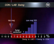
9 O'Clock News Swingometer 1992
So there were some major differences – for example the 1992 Swingometer unveiled on the night was a technological monster featuring a real, mechanical arm that Peter Snow pushed by hand. In contrast, the previous month had seen a different swingometer altogether – a strange little floating arrow which revealed a bar chart as it slid from side to side. It’s no surprise that it didn’t get a second outing!
But the 1992 Campaign, and more specifically the US Election graphics that I designed later that year, did mark a turning point for BBC Election graphics. As New Scientist reported in 1992, these were complex computer graphics, generated live, at broadcast quality. Apart from revolutionising the way Election data was presented on screen, it was also a reaction to the inevitable wasted effort of pre-preparing graphics for scenarios that would never materialise on the night. The BBC press release at the time stated that “Presenter Peter Snow will have more than 200 graphics to choose from for Decision ’92, the Presidential election broadcast, compared to the 5000 graphics prepared for the British general election in April – though only 6 per cent of those were used.”
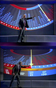
BBC Swingometer 1994
By 1994, the BBC had invested in top-of-the-range Silicon Graphics hardware which allowed us to render all of the European Election graphics that year ‘live to air’.
Although the 1992 graphics used SGI machines, the ‘live’ elements were keyed over pre-rendered 3D backgrounds, so this really was a leap forward. Possibly one of the reasons too that the Election graphics in 1994 got me my first Royal Television Society award nomination.
Looking back on it, more startling is the fact that these graphics were rendered in HD. The reason for this was to keep the images nice and crisp even when the camera zoomed in to Peter Snow’s back-projected screen. If memory serves, the output was rendered at 1920×1152 – which is probably something like analog HD. Anyway, I’m fairly sure it wasn’t 1920×1080.
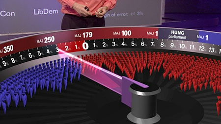
It was also the first time that Peter Snow’s swingometer appeared in 3D – showing the coloured MP’s and percentage swing in the normal ‘flat’ view and displaying the outcome (‘hung parliament’, ‘majority’ etc) on an outer edge.
The swingometer was to remain pretty much unchanged for the next few years, culminating in the famous Election night of 1997, which saw both a Labour landslide and the smile being wiped off Michael Portillo’s face.
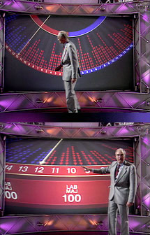
BBC Swingometer 1997
Once again the graphics were all rendered live in HD, both for Peter Snow’s analysis, and all of the remaining results graphics.
We also had a full 3D House of Commons which filled up with little MP’s depending on the forecast numbers as the night went on. Of course, this isn’t what you’d call ‘virtual’ in any sense – the graphics were all still being back-projected.
There’s a useful reference page on Election graphics at TV Ark – it looks like Sky embedded their presenter in a ‘virtual’ Commons chamber – I forget now how well it worked – those early virtual graphics seemed always to be plagued by the feeling that the presenter was lost in his own green-screen world with very little idea of what was going on around him – gesturing half-heartedly towards what (he hoped) was the right bunch of people. Interestingly, that Sky graphic from 1997 seems to show the Conservatives as the largest party – I’m not sure quite what’s going on there.
By 2001, the pressure was on to ‘go virtual’ – but still we steered clear of dropping Peter Snow into a complete green-screen swamp, and instead provided him with a virtual swingometer and virtual House of Commons that appeared magically on a (real) table in the studio. The 2001 swingometer was essentially the same structure as before, but turned inside-out so that it sat within a hollowed-out table-top.
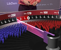
Swingometer 2001
The advantage of this was that Peter Snow could link easily between graphics behind him on the big screen and in front of him on the virtual table, and since we were using the grey material that picks up its colour from a ring of LEDs around the camera, we were able to project a second rendered image on to the table so that Peter could see exactly what the viewer saw, and point to individual figures with accuracy.
Of course, the ‘Holy Grail’ of Election night graphics remains a truly convincing virtual reality House of Commons chamber. My secret sources at the BBC are hinting at something pretty spectacular this time round. The graphic technology is being supplied by Brainstorm – a Spanish company that I worked with on the 2006 Election Special – technically very good, and a really nice bunch of guys too. I know the graphic design team has been working away furiously for months now – I’m keeping my fingers crossed that it all goes well for them on the night.
Good luck everyone!
7 Comments
Does anyone know what the music to the BBC 2010 election trailer is? The same music is being used for Channel 4 Racing in the middle of the programme. I really want it!
DT, I would have bet money it was Boards of Canada. I was completely wrong!
It's The XX – Intro.
http://www.youtube.com/watch?v=ANJb1dzNLXE
It's called 'Intro' by the XX. Great band & great album. Go to Nokia music site and you can download it there or if you have Comes with Music (i.e. if you've bought a Nokia phone with a Comes with Music subscription) you can download it plus unlimited tracks free for a year – better deal than paying per track if you buy a lot of music… check out http://www.nokiamusic.co.uk/
Really nice writeup! The BBC election reel is fantastic! Nice flashback! You should submit this story to Art & Business of Motion the tv branding blog. They've posted some nice UK and US spots for elections as well as news/olympics. Here's the link if you haven't been there before: http://dennytu.wordpress.com
Mike,
How do Exit Polls cope with the fact that Conservative Voters often decline to identify for whom they voted more than Liberal Democrats and Labour supporters? Is this factored back into the result to compensate?
regards
Ken Kirk
Who in their right mind watches television anymore. Twenty years spent staring at it for most of the working day put pay that activity for me. It's all very well showing glossy, Ray-Traced, real-time compu-porn, but how about the long forgotten, flat-shaded, mostly Gouraud, and tiny bit Phongy, (almost) on the day, computer generated solid graphicness that started it all. Yes, from behind that virtual red velvet curtain, into the twinkling frustum of the visible, step forward the mighty ArtStar by ColorGraphics. How can we forget those first stumbling steps. A crude little model of the 'Herald Of Free Enterprise', the passenger ferry that came to grief, a little animated budget box for Newsnight, and then the heady days of the run-up to the 1987 election, and subsequent election influenced title-sequences like Election Call. There was Wimbledon and others I can't remember. Anyway, the other day I was cleaning some shelves, and I picked up all the old Beta tapes that I'd lovingly kept for the last twenty- three years, the masters of all those pioneering bits of computer-generated TV, probably the first on-the-day 3D done on British television, and threw them all away. I had thought about contacting someone at the Royal Television Society to see if they wanted them, but it seemed a more fitting way to dispose of them was to chuck them in a skip in Shepherds Bush Green. Regards,
Paul Re Cotsen
Hi Paul,
Nice to hear from you. Hope all is well at your end.
Funny you should mention Beta tapes. When I was leaving the BBC, I spent a couple of days sorting out all my tapes and stuff. I whittled them down to the bare essentials, and still managed to fill a couple of HUGE cardboard crates with crap – Beta SP, Digibetas, D1, D3, U-matic probably, also a ton of mag-op disks, wax cylinders and the like. As it turned out, I just couldn't be bothered to take any of it home. Probably ended up in a skip near yours in Shepherd's Bush. I do hope so.
I remember when Lime Grove closed down I salvaged pretty much the entire BBC Current Affairs Letraset collection. I kept it safe for many many years – serifs in one box, sans in another, rules and ornaments in a third. There may even have been a fourth box with flags and shit. Anyway it all went in a skip when we moved to Ireland a few years back. I was, perhaps, merely the temporary custodian of the Letraset library, saving it from one skip, only to chuck it another one fifteen years later.
I do still have a box of colour transparencies though – including several rather handsome Breakfast News insets. I'm thinking of scanning them in to the Mac, tidying them all up in Photoshop, printing them all on to glossy card and then skipping the lot. Just for the sake of completeness.