While my favourite G5 was out of action due to graphics card problems, I continued working away on my back-up machine. I’d hardly used the second machine since new – and hadn’t changed the System Preferences for ‘Font Smoothing Style’ – but I was surprised at just how different the text looked.
To show the kind of differences I mean, I’ve taken some screen grabs of some text to demonstrate the kind of changes you might expect to see with different font smoothing styles applied.
The text is grabbed from a page displayed in Firefox 3.05 and is Helvetica (sorry, I couldn’t quite bring myself to use Arial – that’s the graphics purist in me I guess).
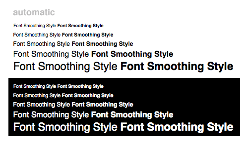
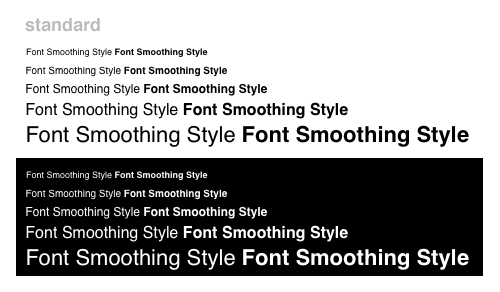
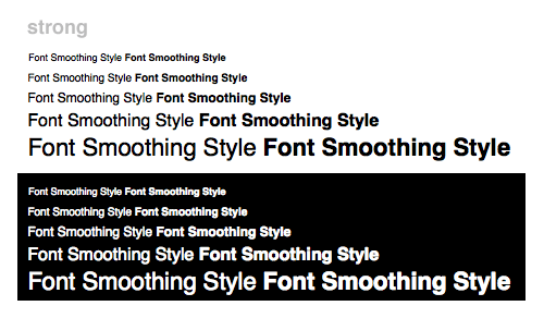
Each image is showing text at 9px, 10px, 12px, 16px and 22px (a bit arbitrary I know, but hopefully you’ll see the differences well enough). Each line has the words ‘Font Smoothing Style’ displayed as normal text, and with ‘font-weight’ set to ‘bold’.
Font Smoothing : Automatic – best for main display
I think ‘Automatic’ must be the default setting for a new machine – personally I find it a little bit soft and blobby especially when displaying white text on a black background (check out that 22px bold… not great). Maybe it’s all those years working in TV, but my main machine uses the ‘Standard – best for CRT’ setting below. Maybe the text breaks up a little at smaller sizes (possibly less so for fonts like Arial or Verdana which were designed for screens), but on the whole I think the relationship between normal and bold text is more pleasing.
Font Smoothing : Standard – best for CRT
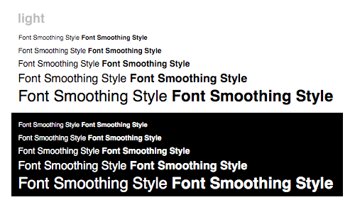
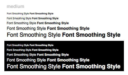
For the sake of completeness, here’s the other settings – Light, Medium and Strong.
Font Smoothing : Light
Font Smoothing : Medium – best for Flat Panel
Font Smoothing : Strong
I suppose in the end it’s all down to what screen you’re viewing things on, and personal preference. Also, it seems that the anti-aliasing (on all settings except ‘Standard’ I think) introduces a load of extra colours as part of the process.
Standard (left) and Automatic (right) anti-aliasing
It reminds me of the kind of anti-aliasing I’d see on Quantel kit back in the day at the BBC. It certainly makes smooth lines at a distance, but now that I’ve seen what’s really going on at a sub-pixel level I can’t help feeling that ‘Standard – best for CRT’ is still the one for me.
I was thinking of doing the same test with more pixel sizes and other fonts (Arial, Verdana, Georgia and ‘Trebuchet MS’ for starters) to try and work out exactly which combinations of pixel sizes worked best with the various settings for Font Smoothing, but I may leave that for another day. I suppose if I ended up doing that I’ve have to test different browsers too. And then do the same on Windows..
Please leave a comment or a link if you’ve seen anything like this anywhere – I’m sure someone somewhere will have already done something like this and worked out exactly which typefaces and pixel-sizes give the most satisfying results for the greatest number of viewers.
Mike
