Hotswell.com is a new surfing website that I’ve been occasionally involved with over the past 2 years. The Hotswell Beta site has recently gone live and is already getting some great feedback.
I’ve created a complete set of surfing icons that appear on the spot guide page for each location (break type, wave direction, optimals, hazards etc).
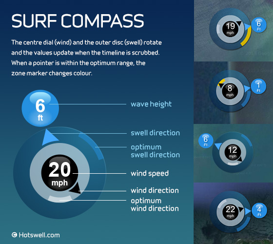
I’ve also designed some little data visualisation devices like this one – the ‘Surf Compass’.
It’s basically a little graphic that sits on top of the Google map for each location. The centre dial shows wind speed and direction. The outer dial shows wave height and swell direction. The compass will show the current data for any particular surfing location and will update itself when the timeline is scrubbed on that page.
The ‘ideal’ or optimum wind and swell directions marked on the compass as feint little bands which change colour to gold/orange when the arrow enters the optimum zone.
This ties in with the warm colour scale (yellow – orange – red) used throughout the site to represent increasingly favourable surfing conditions – culminating in a ‘hot’ (red) 5-star rating.
It is actually quite easy to scan all the locations in your region at once to see where the best breaks will be over the coming days and then to check the surf compass for a particular location to see exactly when swell and wind combine (perhaps with the optimum tide) to produce the best possible chance of great surfing conditions.
I think the site really comes into its own when the marker on the main timeline on each break page is scrubbed along and every single relevant bit of data on the page updates instantly to show the conditions for that particular time. I’m told by Tim, the technical wizard behind the code, that the site’s break pages “update the html elements via jQuery and lots of javascript code. The compass and tide box are HTML5 canvas elements”.
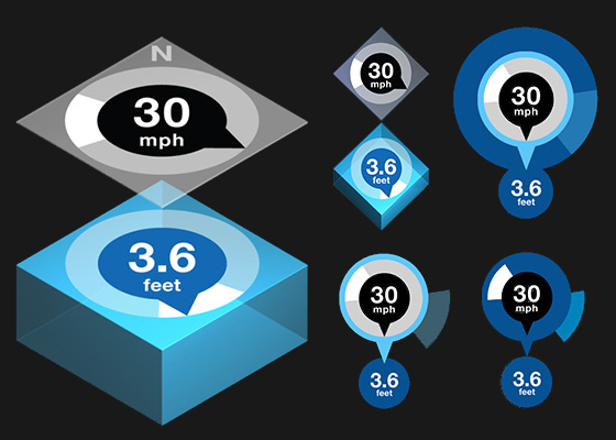
Here’s a little montage of images showing the development of the Surf Compass from the early ‘3D’ version where I tried two separate dials with the ‘wind’ above the ‘water’, through to some versions nearer to the one that appears on the Hotswell site.

