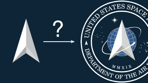
Donald Trump unveiled his new Space Force logo recently, and of course everyone immediately noticed a striking similarity to the Starfleet Command emblem from the Star Trek TV show. Quite right too.
But hang on a minute.
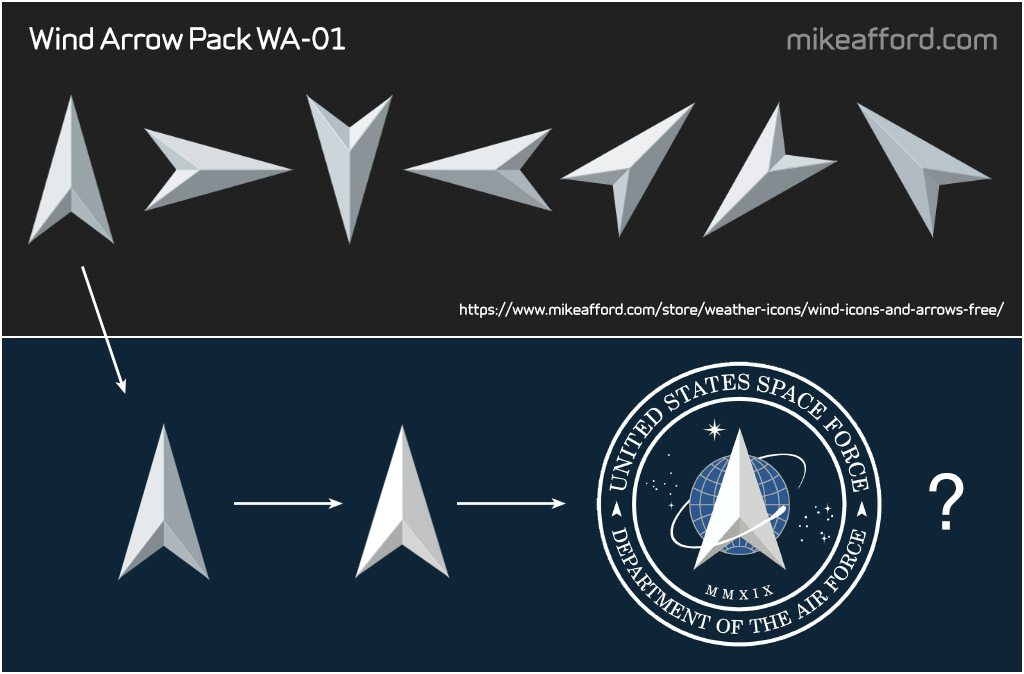
The one part of the new Space Force logo that’s quite different from the Star Trek version is the ‘arrow’ device in the centre. Which bears (I think!) an even more striking resemblance to this arrow I designed years ago as part of my free pack of Wind Icons and Arrows that you can still find on my page of weather symbols.
Star Trek’s George Takei suggested on Twitter that the Trump administration pay the cast “royalties”. I certainly wouldn’t mind a little extra cash meself. What are my chances ??
As far as I can tell, the arrow in the centre of the Space Force logo is exactly the same as mine, but just ever so slightly wider (maybe just 5% or so), and a little brighter, with just a very slight adjustment of the shading on the lower right hand side. Apart from that, it is LITERALLY identical.
But, on the other hand, let’s be realistic. It is just a very simple arrow, and nothing special really. I’d be surprised if there haven’t been hundreds of very similar arrows designed over the years. Just coincidence I’m sure.
Anyway. There it is.
Live long and prosper!

