
BBC Weather map colours
I’ve been puzzling over this for a couple of days now. *
I’d noticed that the new BBC Weather website was using a different colour for the sea on their maps.
I’d originally designed the weather maps with a deeper blue for the sea, so I was intrigued to see the colour had changed to a paler, less saturated, and slightly more ‘greeny’ blue (some of the more ‘greeny’ blues I’d previously reserved for light rain).
One of the first effects I noticed was that the actual colour on screen for certain levels of light rain over the sea was virtually identical to that of light cloud.
I suppose it’s just a small point really. It’s still fairly obvious where the rain is – but I was just a bit puzzled as to why a (presumably) cosmetic change to the sea colour should have made the rain data in particular so much more ambiguous and obfuscated.
Anyway – I think I’ve figured out why the new maps don’t look quite right to me.
Just a theory this – but when I compared a map showing the forecast a few hours from now with a longer-range forecast it looked as though the rain data was showing up a bit more clearly on the latter. And that is despite the long-range data being of a lower resolution. Take a look at the image below, and hopefully you’ll see what I mean. The map on the left uses higher resolution data, but even so, that band of rain I’ve circled looks kind of duller. A similar band of rain on the right-hand map looks kind of brighter to me.
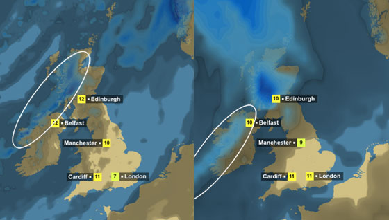
I know the higher resolution map is picking up more areas of heavy rain within that band (and consequently displaying deeper blue areas here and there) – but I reckon what’s actually going on is that the layers of data are being drawn in the wrong order.
I could be wrong, but it looks very much to me as if the short-range maps are drawing the rain layer first and then having the ‘shadowy’ cloud layer drawn on top. Since the rain only appears where there’s cloud (naturally enough!) the end result is that the entire rain layer is being darkened down by a transparent black layer on top.
The long-range map appears to be (correctly) displaying the cloud data first (like a shadow on the ground) with the rain data drawn on top.
Back in my old BBC days this would normally be the point at which I would stroke my chin sagely and say “Hmmm… Possibly a z-buffering issue…”
Anyhoo, as I say I can’t be sure, but it should be much easier to tell once it starts snowing everywhere…!
* I should point out that I haven’t been puzzling about this non-stop for a couple of days. It’s been more a kind of intermittent puzzling.