I recently came across an article (albeit from last year I think) by Takamasa Matsumoto concerning the Apple ‘iCloud’ icon and the Golden Ratio. He explains that the basic shape of the cloud icon is based on four circles and both pairs of diameters are in the ratio 1:1.6. The ratio of height to length of the whole cloud shape is also 1.6 – which is ‘close to’ the Golden Ratio.
I’m someone with more than a passing interest in cloud icons, so this got me wondering…
The actual value of the Golden Ratio (a.k.a. Golden Section, Golden Mean, Divine Proportion, and often written as the Greek letter phi, φ) is (√5+1)/2 or 1.6180339887… So why would the Apple iCloud icon use a value of only 1.6? Perhaps by accident, rather than by design?
I mean, if you’re going to the effort of basing something on the Golden Ratio, wouldn’t you try and get the number right, or at least use a better approximation? It’s not as if graphics software can’t handle more than one decimal place…
Would the real iCloud please stand up
To find out if 1.6 really is close enough, I thought it might be interesting to see just what a ‘true’ Golden Ratio cloud icon might look like.
How easy would it be to tell them apart? And might one be more ‘beautiful’ than the other?
![]()
How to build a ‘True Golden Ratio Cloud’
First we need a bounding box to fit our cloud in. This time, the ratio of height to length needs to be exactly 1:φ
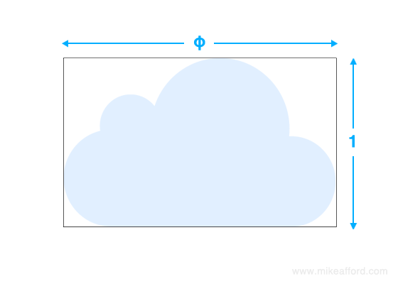
The ratio of the diameters of our first two circles needs also to be exactly ‘golden’. A very quick and easy method is to halve the width and height of the bounding box and use these values as the diameters. The circles are now precisely in ‘divine’ proportion.
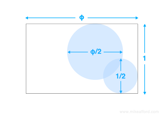
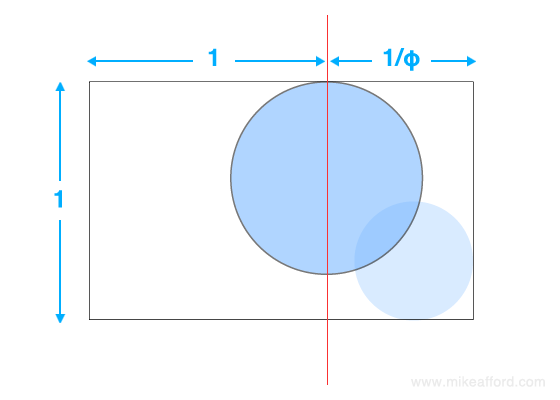
The first circle sits exactly on the line that divides the length of the box according to the golden ratio. The second circle is placed so it’s touching the baseline and the right edge.
We now need two more ‘divinely proportioned’ diameters for our remaining two circles. Surely it would be churlish not to make them 1/φ and 1/φ²…?
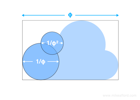
Let’s place the larger of them on the baseline at the left. The smaller one can sit in a number of different and potentially ‘pleasing’ locations, but let’s try putting it on the line that splits the height of the bounding box according to the Golden Ratio. We can position it so that its left edge lines up vertically with the centre of the other circle.
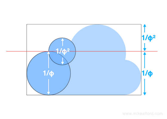
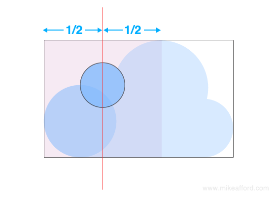
The centre of the small circle also sits exactly halfway along a unit square horizontally. That’s the beauty of sticking to an accurate value for the Golden Ratio – inevitably ‘happy accidents’ tend to be exact.
So what does that give us…??
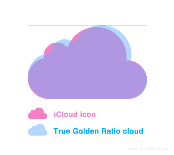
Well, as you can see, my ‘true’ Golden Ratio cloud is different, but not wildly different from the actual Apple iCloud symbol.
I guess there’s a few possible explanations.
Maybe it’s just pure coincindence. The designer of the original Apple iCloud logo just created something that looked visually pleasing to him/her with NO (intentional) reference to the Golden Ratio.
Maybe the designer intended to use the Golden Ratio, but felt that 1: 1.6 was near enough. Or mistakenly thought that phi was 1.6000000…
Or perhaps the original design of the iCloud logo WAS based precisely on the correct value for the golden section, but for reasons unknown was altered slightly somewhere down the line.
Who knows.
Conclusion
Is there a conclusion…? I’m not sure.
But I suppose my point is this. You don’t have to look very far to find designs with proportions that are ‘close to’ the Golden Ratio. But that doesn’t necessarily mean that they’re actually based on anything at all. Any particular ‘beauty’ they possess may simply be the result of good judgement by the designer. And even when the Golden Ratio IS used as a precise starting point, subsequent revisions ‘by eye’ may produce a MORE aesthetically pleasing result. ‘Divine’ proportions aren’t necessarily better than mundane ones.
So, finally, lets see if we can answer the original questions above.
Q. Is one of these clouds the real Apple iCloud icon?
A. Yes. It was the one on the right.
Q. Is one of these clouds more ‘visually pleasing’ than the other?
A. Well, you decide. Which is it? Personally I think the Apple one is still better – somehow more ‘balanced’.
Further Reading
You can read the original article by Takamasa Matsumoto here (English version) The law of beauty hidden behind the iCloud icon
I was also inspired by Scott Hanselman’s article There is only one Cloud Icon in the Entire Universe
You can read about some of my own work for BBC Weather on the BBC’s cloud icons here
4 Comments
Hi.
My name is Marco and I'm from Brazil.
I was doing some research on Fibonacci numbers and spirals, when I came across your article in the Google image search. It got my attention immediately because I like everything related to Apple.
I loved your explanation on iCloud icon and the Golden Ration.
It made me think that there are some natural designers that can create beautiful things in quasi Golden Ration and not even know about. It is ironic that some artists even don't like math or calculus.
As I always say to my kids, math is everything.
I won't publish my name here, but you can confirm who I am through email.
I'm a former apple designer and I can tell you that was a simple coincidence.
It was not meant to follow the golden ratio.
It's funny what I see people talking about that logo.
Thanks for the link to the English version of the original analysis. I have seen the Japanese version and a lot of comments and claims about this before. The English version confirms for me that the analysis and conclusions drawn are invalid.
In one sense I think you are correct: working to one decimal place will not be accurate enough. I prefer rounding the value to three decimal places (1.618) when using the golden ratio, or I work geometrically. Working geometrically with a compass and straight edge (the traditional method) is more than accurate enough to generate this ratio. If using vector or CAD software, working with the ratio to as many decimal places as possible adds no practical value to the design process. Three decimal places is sufficient.
For those of us who use the golden and related ratios, we use them as a compositional guide. We don't slavishly adhere to them. It's also a common misconception that using the golden ratio is going to result in a design that fits inside a golden rectangle. In my experience of using the golden ratio as a measure, this has never been the case, and would never happen unless it was an intentional part of a brief. On a side note, I have never seen a naturally occurring golden rectangle!
Excellent article. After observing the two images, at the beginning of it, the left one was the one that I labeled for my subjective visual taste more appealing. Of course the original icon is also good, but the "contrast" that the bigger circle on the left compared to smaller one on the left seems to be reason that made it inevitable to be more appealling. Fascinating that it turned out to be the golden ratio one.
As someone that draws, designs and experiment with different ways to have a creative output, I can say that not every logo, painting or design must be made on purpose to fit that or any other similiar mathematical formular. That also is the case for symbolism that gets interpreted into artworks, paintings, logos, music videos or songs nowadays, which has become popular on social media to be spread around without any evidence or consultation of the artist.
Thanks for the step by step images of your process creating your version of the iCloud icon, since it refreshed my math filecase in my greymatter internal harddrive.